

Brand refresh and guidance
LIVING AS A LEADER
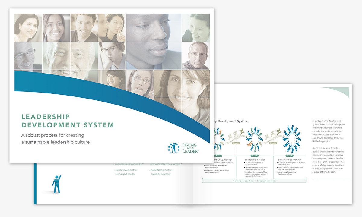
If you’ve ever picked up a well-designed brochure from a brand you like, you know how inviting each turn of the page can be. It’s not just photography and words at work. There’s something about the way paper feels. Not to mention the feeling that you know the brand. It’s familiar. That’s important because studies show people are attracted to what’s familiar.
Living As A Leader asked us to refresh its look. We developed a brand standards guide that included direction on typeface and fonts, a color palette, word choice and tone, logo usage and more – all tied to the image they wanted to project. Over the years, they received several unprompted compliments on the design of their materials.
Industry:
Consulting
Collateral, Illustration